The Billboard Rule: Why Less Is More in Podcast Cover Art
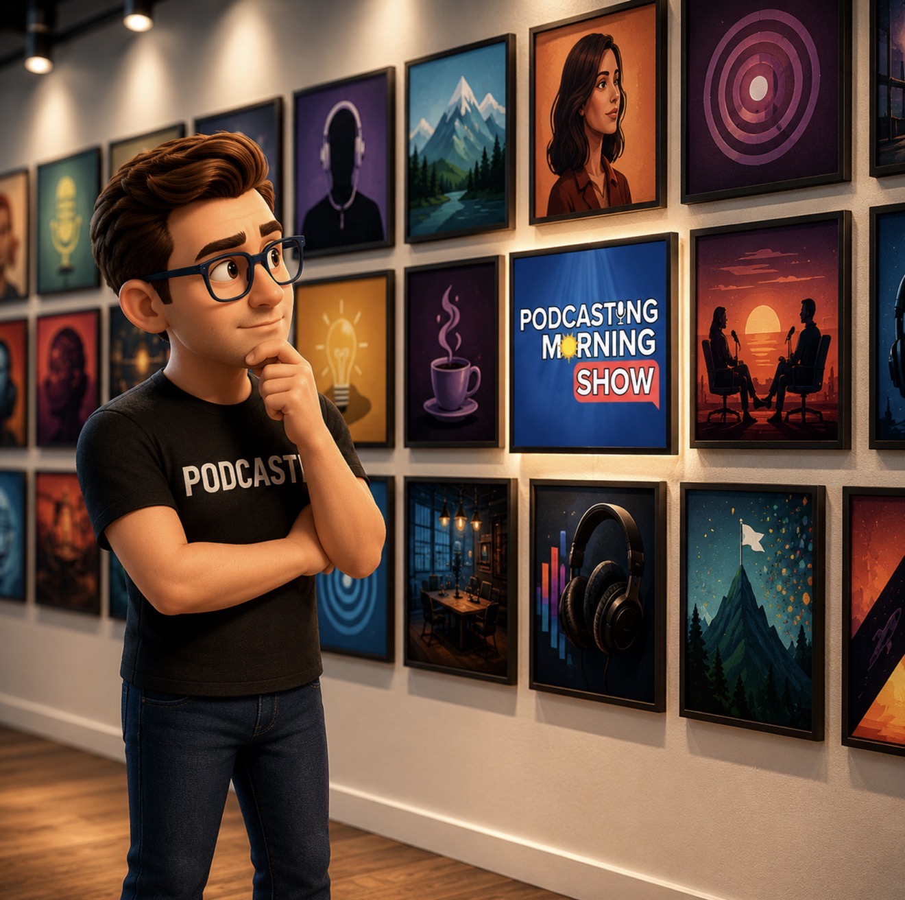
In what can feel like a crowded industry of podcasting, your podcast has only a few seconds to capture the attention of a potential listener. Before they ever hear your voice, your intro music, or the quality of your guest interview, they make a split-second decision based on a single image: your cover art. In this post, we dive deep into the psychology of visual discovery and why, when it comes to podcast branding, simplicity is your greatest competitive advantage.
This discussion serves as a companion to our recent deep dive, 543. How Effective Is Your Podcast Cover Art?, where we break down the mechanics of creating visuals that convert scrollers into listeners. Read on to learn how to apply the Billboard Rule to your show.
The First Handshake: Why Cover Art Matters
Think of your podcast cover art as the digital equivalent of a physical handshake. It is the very first point of contact between you and a future superfan. When a listener is browsing Apple Podcasts, Spotify, or any other directory, they are scanning hundreds of options simultaneously. In that sea of noise, your artwork acts as the filter that decides whether they stop to investigate further or keep scrolling.
If your art is cluttered, low-resolution, or confusing, the psychological takeaway for the listener is often subconscious: "If they didn't put effort into their branding, they probably didn't put much effort into the audio production either." Conversely, professional and striking artwork signals authority, consistency, and value. It sets the tone for your brand and acts as the gatekeeper for your listener's time.
Understanding the Billboard Rule
The "Billboard Rule" is a classic principle of advertising that translates perfectly to the world of podcasting. Imagine you are driving down a highway at 65 miles per hour. You glance at a billboard for only a second or two. If that billboard has a paragraph of small text and a complex, intricate illustration, you will miss the message entirely. You will not pull over to read it; you will simply move on.
Podcast listeners are the "drivers" of the digital highway. They are scrolling through feeds on their mobile phones, often while multitasking or moving quickly through lists. Your cover art must be legible at a glance. It needs to communicate what your show is about instantly, without requiring the user to zoom in or squint. If your artwork requires a viewer to stop and think, you have already lost the opportunity to earn a click.
The Power of Five Words or Less
The most common mistake podcasters make is attempting to fit the entire mission statement of their show into the cover art. Often, we see titles, sub-titles, host names, and taglines all crammed into a tiny 3000x3000 pixel box. When this image is shrunk down to 50x50 pixels on a mobile device, all that text turns into an unreadable blur.
The "Five Words or Less" rule is your best defense against this clutter. By limiting your text to five words—or ideally, just the title of your show—you force yourself to prioritize what truly matters. If your title is short, you have room for a graphic element. If your title is long, you have no room for anything else. This constraint isn't a limitation; it is a creative framework that ensures your main brand identifier is bold, large, and unmistakable on any screen size.
Why Simplicity Beats Complexity in a Scrolling World
Complexity is the enemy of conversion. When a designer tries to pack too many elements into a small space, the human eye struggles to find a focal point. In the world of user interface design, we talk about "visual hierarchy." You want the eye to land on one primary element immediately. If you have five different competing elements, the brain experiences "choice paralysis" and ignores the image entirely.
Simplifying your art means removing gradients that don't serve a purpose, eliminating stock photo clutter, and embracing "negative space" (the empty areas of your design). Negative space allows your primary imagery or text to breathe. When a design breathes, it looks premium and intentional. In a market saturated with "busy" designs, a clean, bold, minimalist aesthetic stands out precisely because it is rare and easy to process.
Practical Tips for Readable Artwork
How do you ensure your design holds up under scrutiny? First, check your contrast. If you have dark text on a dark background, it will disappear. Use high-contrast color palettes that pop, even in low light or on a small screen. Second, choose your typography wisely. Avoid thin, cursive, or overly decorative fonts that might look fancy but become impossible to read at small scales. Opt for bold, sans-serif fonts that maintain their integrity even when pixelated.
Finally, perform the "Squint Test." Take a look at your cover art and squint your eyes until the image is blurry. Can you still tell what the main subject is? Can you still recognize the title? If you can't read the text while squinting, your artwork is likely too complex for the average listener to decipher while scrolling.
Building Trust Through Visuals: Faces and Branding
There is a powerful psychological component to including a face in your cover art. Humans are hard-wired to notice faces, and it builds an immediate bridge of trust. If you are the face of your show, including a high-quality, professional headshot can create a parasocial connection before the first word of the episode is ever spoken. It humanizes the brand.
However, this doesn't mean you should just drop a random photo on a background. Your face should be the anchor of the design. Ensure the lighting is good, the background is removed or simplified, and that the photo conveys the energy of the show. If you are a comedy podcaster, your expression should match that vibe. If you are a serious business mentor, your professional attire and calm demeanor should lead the way. Your face, combined with your brand colors and a short title, is often the most effective formula for building initial trust.
Testing Your Design for Click-Through Success
How do you know if your art is working? You don't have to guess. Use A/B testing. Many podcasters create two variations of their cover art and test them over a period of weeks. You can also utilize free tools or social media polls to see which design resonates more with your target audience. Ask your listeners directly: "Which of these two images makes you want to click on the episode?"
Remember that the goal is not "artistic beauty," but "click-through success." Your cover art is a marketing asset, not a museum piece. If a design looks beautiful but doesn't result in downloads, it is failing. Be willing to pivot if your data shows that your audience is ignoring your show. Small tweaks—changing a font color, increasing the size of your name, or flipping an image—can often lead to surprising upticks in listener discovery.
Conclusion: Making Your First Impression Count
Your podcast cover art is the silent ambassador of your show. It speaks to potential listeners while you are asleep, working, or recording the next episode. By following the Billboard Rule—keeping your text to five words or less, embracing simplicity, and ensuring high-contrast readability—you turn your artwork into an effective tool for growth rather than a missed opportunity.
I hope this breakdown gives you the confidence to audit your own branding and make the necessary changes to stand out in the directory. For more tactical advice on how to test your artwork, the psychology behind listener decisions, and even the nuances of using AI in your designs, be sure to listen to our full conversation in 543. How Effective Is Your Podcast Cover Art?. Every small adjustment you make to your visuals is an investment in your show’s future success. Start small, test often, and keep the listener's experience at the forefront of your design process.

Host / Executive Producer
With a career spanning 20+ years in podcasting, Marc Ronick is the driving force behind iRonick Media and founder of the Empowered Podcasting Conference. His innovative approach to audio & video content, including the integration of AI-driven tools, has set new industry standards. As a daily social audio host on Clubhouse, Marc engages with fellow podcasters, sharing insights on everything from mindset to the latest news in podcasting. His commitment to empowering others and his passion for creativity make him a sought-after voice in the podcasting community.
When You Find Your People You Become Empowered